History is a topic that benefits from a variety of teaching methods. Sometimes it is best to read a book featuring primary sources and information directly from a specific time period, other times a lecture may be more appropriate. However, with the advancement of technology and digitization of many historical objects and documents, digital tools are becoming increasingly helpful for learning about history. Anything from YouTube videos, to video games, or even interactive online maps can be useful and fresh ways of seeing history. While internet access and the ability of people to navigate the web remains an issue, it is still important to have historical information online. It can not only provide a greater breadth of information to those who search for it, but educational videos or interactive sites could spark an interest in history from people who may not have given the subject much consideration.
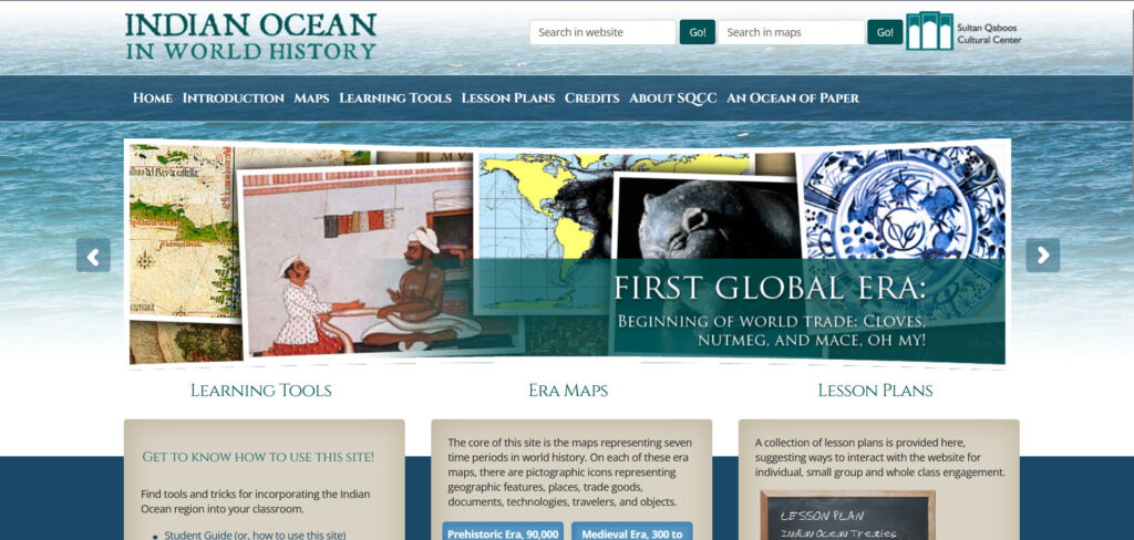
As it turns out, many organizations and historians are beginning to realize the importance of online tools to either reach new audiences or showcase more information than what was possible before. Organizations such as the Sultan Qaboos Cultural Center (SQCC), a Washington DC based group that focuses on education about Omani and Arabic cultures, have begun to use online tools in history education. Their current largest project is the Indian Ocean in World History. The project was remade in 2016 and is constantly being expanded upon, with 2019 providing a large increase of documents added to the site.
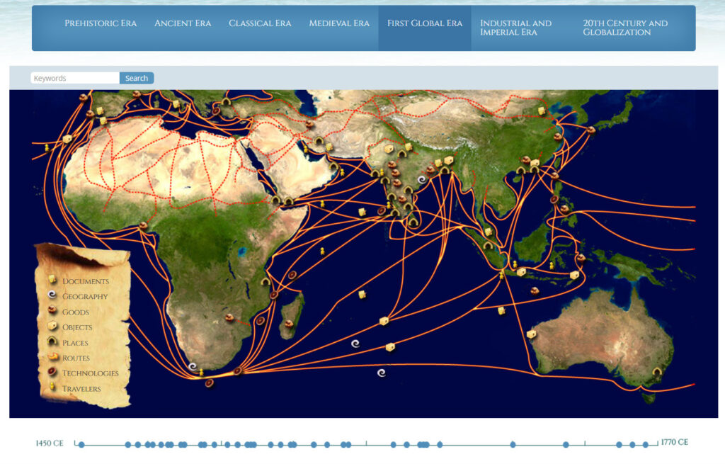
The website features lesson plans and learning tools for teachers to use in the classroom, as well as the most important feature, the various maps. Most of the work on the site focuses on the maps, which show a wide range of information about the Indian Ocean and how human civilization progressed alongside it. There are seven different eras which have maps associated with them. Within each era, there is also a helpful timeline below the map which showcases major events that occurred during the time period. There are seven different types of interactable icons on each map, as well as arrows to indicate trade or travel routes. Each icon you click on has unique information about a person, place, or object and often includes images. There is nearly endless information about the Indian Ocean spread across the seven different era maps which you could spend hours looking through.

The project’s purpose is to argue for the importance of the Indian Ocean for trade and civilization as a whole throughout all of human history. In my opinion, the project conveys information effectively and is well structured for the most part, providing a good argument for their purpose. Additionally, it is important to note that there is more of a bias around Oman due to the organization that created the project. While this is not particularly a bad thing since education about Omani history is not common in the United States, the bias is still visible on the maps since a larger density of information is clustered around Oman in many of the eras. Overall, the project is effective in indicating the importance of the Indian Ocean throughout history with its wide range of information.
However, there are some flaws to the project which could be addressed. To begin, while the information is very good and one could certainly learn a lot while navigating through the various maps, there is concern about how much reach the project has. Personally, it was not very easy to find this project even while looking specifically for digital history projects. This is an issue when the main purpose of the website is to provide education and a tool for history teachers to utilize. Those who are less tech savvy will likely struggle in finding and navigating the site. Accessibility and outreach is vital to a project such as this, and unfortunately an area where it falls short.
The map itself is also very basic in its technical complexity, which is a major downside. All the era maps are just an image of a world map focused on the Indian Ocean. There is no interaction with the map, no zoom functionality, and no creativity in its depiction. During some eras, there are a lot of interactable icons which overlap with one another, making it difficult to click on a specific icon. A simple zoom function which expands certain areas would eliminate this problem as a whole. It would also be interesting to be able to sort by the categories of icons on the map. Moreover, the project would likely be more interesting if it used some advanced mapping software such as ArcGIS. In this case, the map would be more visually interesting while still retaining its simplicity in its use. Regardless, the information presented is still good and the maps are interesting enough.
Additionally, the organization’s website and social media has some issues which make it difficult to fully learn from the project. The SQCC website often returns with an error message when trying to access it, which would cause many to immediately click off (you may have experienced this while attempting to access it). There is a fix to this, which is painstakingly refreshing the page until it works, which you have to repeat every time you navigate somewhere else on the site. This is an unfortunate issue to have for a creator of a digital history project and should be fixed. The organization also has very little social media presence, which loops back to the issue of reaching different audiences. These are crucial problems that should be addressed.
Overall, the Indian Ocean in World History is a very informative and effective digital history project. Despite its flaws, there is still a vast range of information to be gathered from the project. It certainly deserves more attention and could become even more interesting if SQCC continues to develop it. If I were to teach world history, I would likely spend some time using this website as a tool.
