Julia Needham
Description
This website was created by the actual organization/ museum that owns and runs the Anne Frank House. This website gives the user the ability to take themselves on a private tour of the original annex and is replicated from the ’40s. Located in Amsterdam, this allows its viewers who might be fortunate enough to travel to see the house in person. This flexibility communicates to the user that it’s not just for those who can afford to visit the museum, it’s an educational tool for everyone to access.
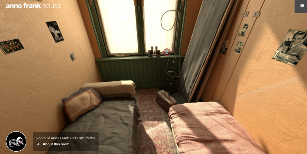
The virtual project is complete, and its graphics are very realistic. Exploring the different rooms, you’re able to go further and look at actual copies of Anne’s diary, or the famous attic. This website gives the user more to look at because, from my own personal experience, some of these rooms were closed off. This gives the benefit of being able to explore more rooms than the actual museum itself.
The website explains how the Anne Frank Museum has done so much historical research. Piecing rooms together, they analyzed different materials used in the rooms so they could give an accurate replica of the annex. Otto Frank, who is the father, was the only surviving member of the Frank family.
Pictured here, is when the museum opened in the 1960s. An emotional Otto Frank stands where his family used to be.
The “target” audience is everyone. The website features links to educational resources about antisemitism and stereotypes. It’s important for everyone to be educated on this matter, but the Anne Frank Museum website also provides some. There is also a link to signing up schools to be able to go visit, educating the younger generation about what the Holocaust is and why it’s so important to study and to see it first hand. Although I couldn’t find the exact date of when this was published, it does look and feel very modern which makes me believe it’s been in the last four or five years.
Analysis
Overall, the look of the website feels organized and clean. It’s easy to navigate and they give an appropriate amount of text rather than it being overwhelming to read (although it’s a very important topic to cover in depth). The argument here is to spread awareness of the Frank family and the similar trauma that other families faced. They highlight how normal and relatable Anne is. Showing viewers this, allows them to spread awareness about antisemitism and shoot down stereotypes. They were innocent people, who were killed out of hatred by brainwashed, immoral German soldiers.
Since this website is very easy to navigate, this helps with the digital divide. Any age group can navigate this website, with its simplistic design, it can be navigated by just about anyone. What I also find extremely important is that it’s available in 20 different languages. They successfully made use of accessibility by giving virtual tours, easy to navigate, and providing multiple languages so everyone can learn the history of Anne Frank and her impact.
There’s not so much an argument being made with this virtual tour, but more of an exploratory feel to it. The purpose of this virtual tour is supposed to spread awareness as well as educate about the Holocaust as a whole through the eyes of Anne Frank. Since Anne Frank is recognized for her diary and writing about her experience in the Holocaust, people tend to see her as a symbol of that time period. The virtual tour gives a POV stance, and the viewer has the mobility to look at the home without actually having to travel to Amsterdam.
Criticism
My evaluation of this project is that it’s such a useful tool for children and grandparents. They get the message across and share the life of Anne in a visual, educational way. Since it’s a hands-on project with its visuals, it leaves an impression on the viewer. Me, I’m a visual learner and I feel like I retained more information from this website than from reading a 20-page research article.

The virtual tour has so many strengths. You’re able to feel like you’re there in the ‘40s, although not a positive time period. The POV is the feature that makes this website feel so real. There’s no lagging or graininess from the graphics, everything flows nicely when scrolling or moving around the cursor. For example, let’s walk into Anne’s room. They give you the option to be able to explore more in-depth, like historical artifacts of Anne’s. They show what she had on her wall and give more of an explanation about her personality, and what she liked.
All in all, they did a very successful job of showing what Anne would’ve seen back in the 1940s. A goal that is intended is for the viewer to have a POV type of interaction with the tour, and knowing her story makes it feel eerier. They achieved their goals I would say and they did a great job doing so. It’s super interactive, accurate, and easy to use.
Home. Anne Frank Website. (2023, January 15). Retrieved April 14, 2023, from https://www.annefrank.org/en/